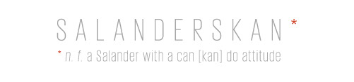
CATASAURUS LARDER: Pet food
Client: Student project Year: 2014 Involvement: Designer The brief: After finding only half-empty food bowls and numerous hunting trophies left by Catasaurus, her owner Susan decided to create her own back-to-nature cat food. I was briefed to provide packaging that reflected her core values.
BRANDING & PACKAGING FOR CAT FOOD
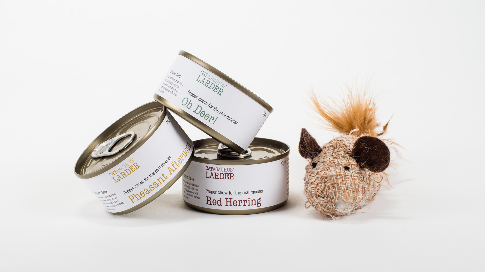
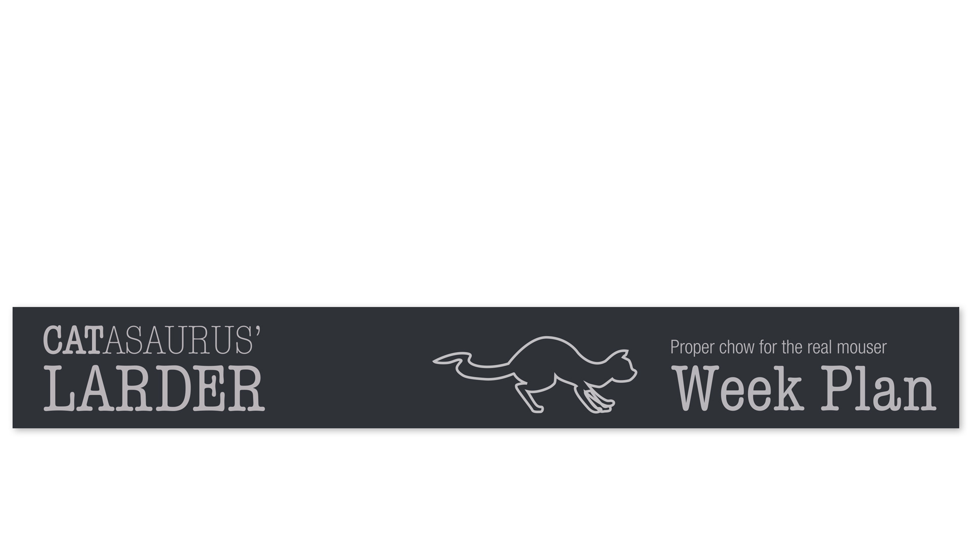
With the tone of voice and hand drawn cat illustrations, the brand emphasises Catasaurus’ cheeky nature. The clear typesetting and information hierarchy plays an important role in reassuring the purchaser of the brand's authenticity and quality in an industry that has garnered a poor reputation.
BRANDED PACKAGING FOR PET FOOD
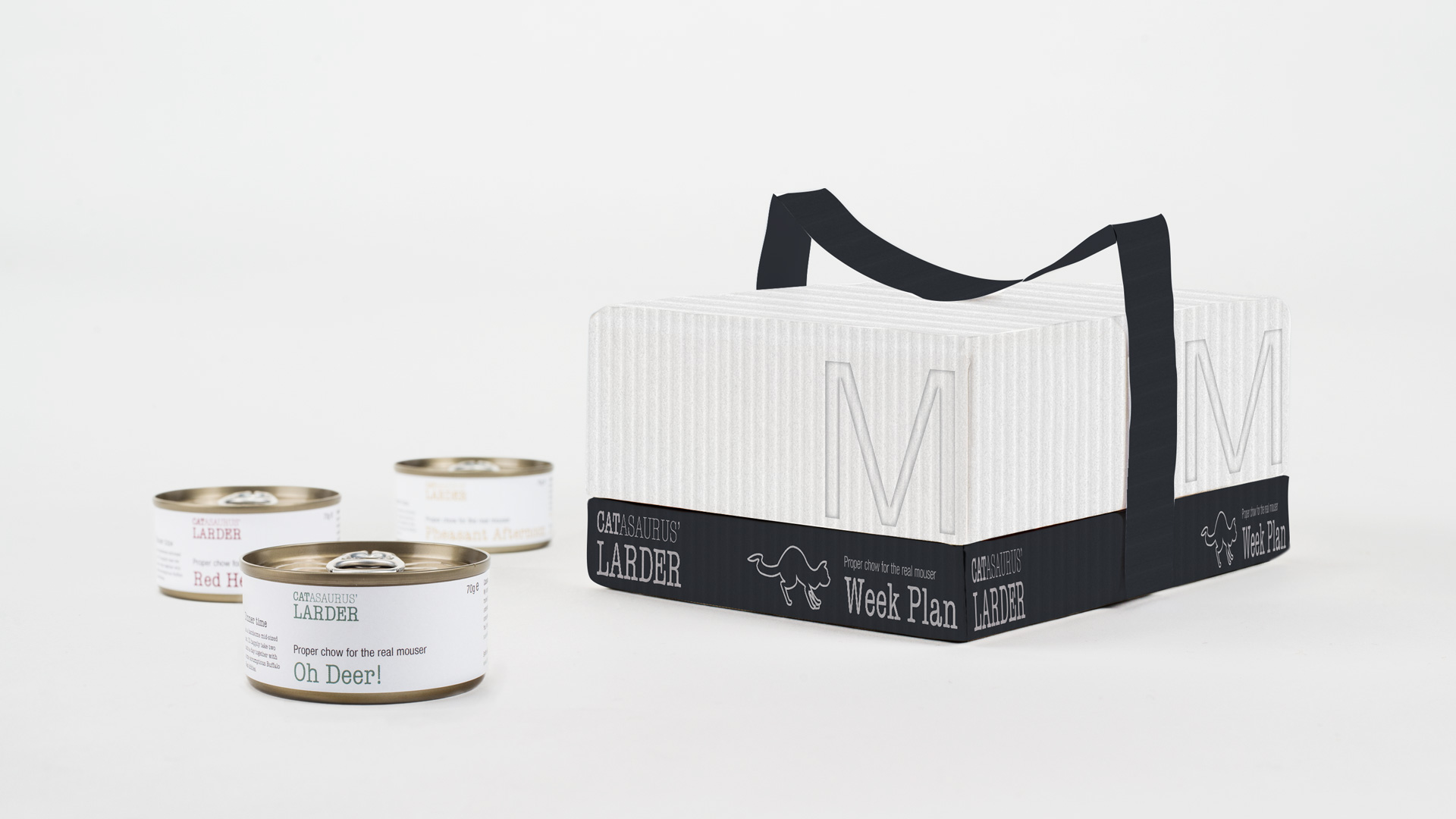
I developed a concept of a weekly pet food box, which could be either delivered to the pet owner weekly or purchased at a local pet shop. The box would contain enough cat food for a week and come in three sizes; S—small for a small-sized cat; M—Medium for a mid-sized cat and L—Large for the bigger cat.
I developed a concept of a weekly pet food box, which could be either delivered to the pet owner weekly or purchased at a local pet shop. The box would contain enough cat food for a week and come in three sizes; S—small for a small-sized cat; M—Medium for a mid-sized cat and L—Large for the bigger cat.
PET FOOD BRANDING
I developed a tone of voice based on a cheeky cat speaking to pet owners, which set the scene for the remaining brand elements that I designed. The product names and brand name reflects this as well as linking back to the 'back-to-nature' idea behind the products. I also developed the brand story of how Susan came up with the product idea.
I developed a tone of voice based on a cheeky cat speaking to pet owners, which set the scene for the remaining brand elements that I designed. The product names and brand name reflects this as well as linking back to the 'back-to-nature' idea behind the products. I also developed the brand story of how Susan came up with the product idea.
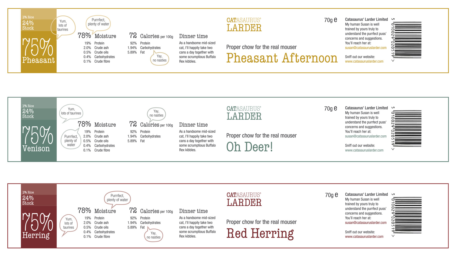
INFORMATION DESIGN OF LABELS
Pet food labels have a large amount of legally required information, that sometimes can be rather obscure for the uninitiated pet owner. The need to provide an easily understandable and explanatory label that still meets the legal requirements became my guiding principle for the design of the dielines.
LOGOTYPE AND TYPEFACE FOR PET FOOD
I chose the American Typewriter typeface for the logotype and product names to give a slightly retro and quirky feel to the brand matching the tone of voice developed. This is coupled with Helvetica for all other texts to provide a balance to the brand; to reinforce the honesty and authenticity of the products.