CULT.UR: e-Magazine
Client: Student project Year: 2014 Involvement: Designer The brief: To create the masthead and layout for a brand new e-magazine targeting the tastemakers of the creative community, wishing to become the global resource for news interviews and reviews, and thus make a positive contribution to art and culture.
Solution
My design solution for this e-magazine is grounded in it being solely digital and the possibilities that this entails. The masthead is interactive and the user can tap within the logotype to select different editions. I also chose a name that in itself is a functional web address. I chose a colour palette of pure RGB to reflect the digital world, but also to link up with the artist’s primary colour base.
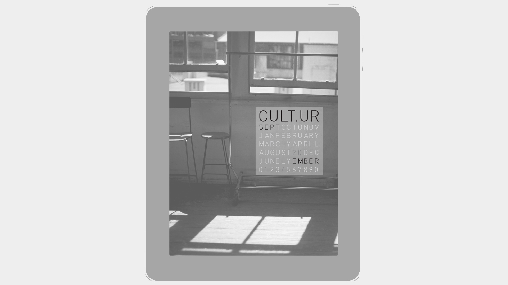
MAGAZINE COVER AND MASTHEAD
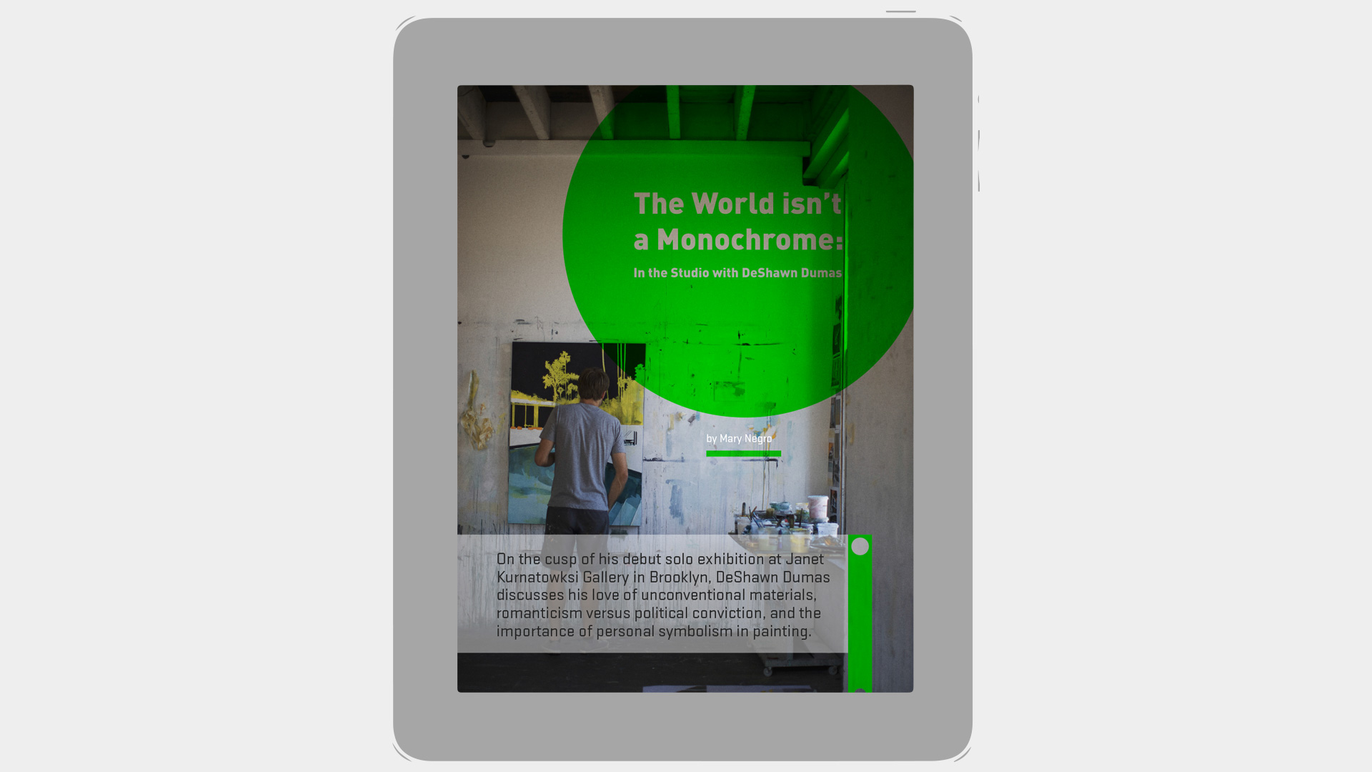
ARTICLE COVER
Navigation through an iPad magazine tends to be both horizontal and verticle. The challenge this poses is how to tell the reader where to go next. I deviced the green line with thumbsized holes to indicate where they can tap or swipe for more.
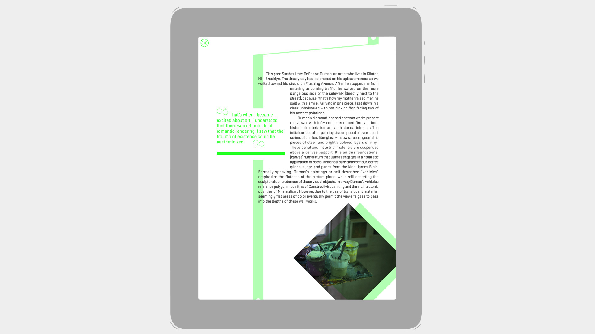
MAGAZINE TYPESETTING & LAYOUT
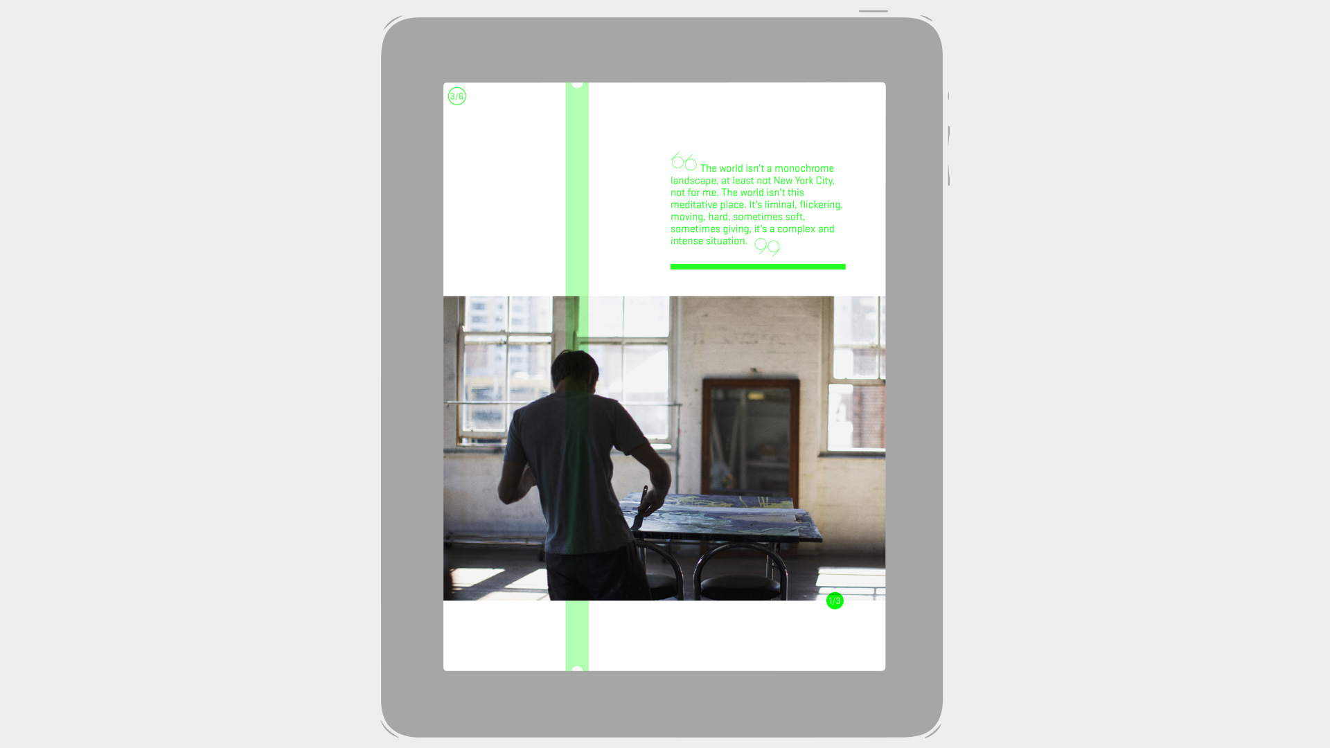
MAGAZINE LAYOUT WITH IMAGE SLIDER
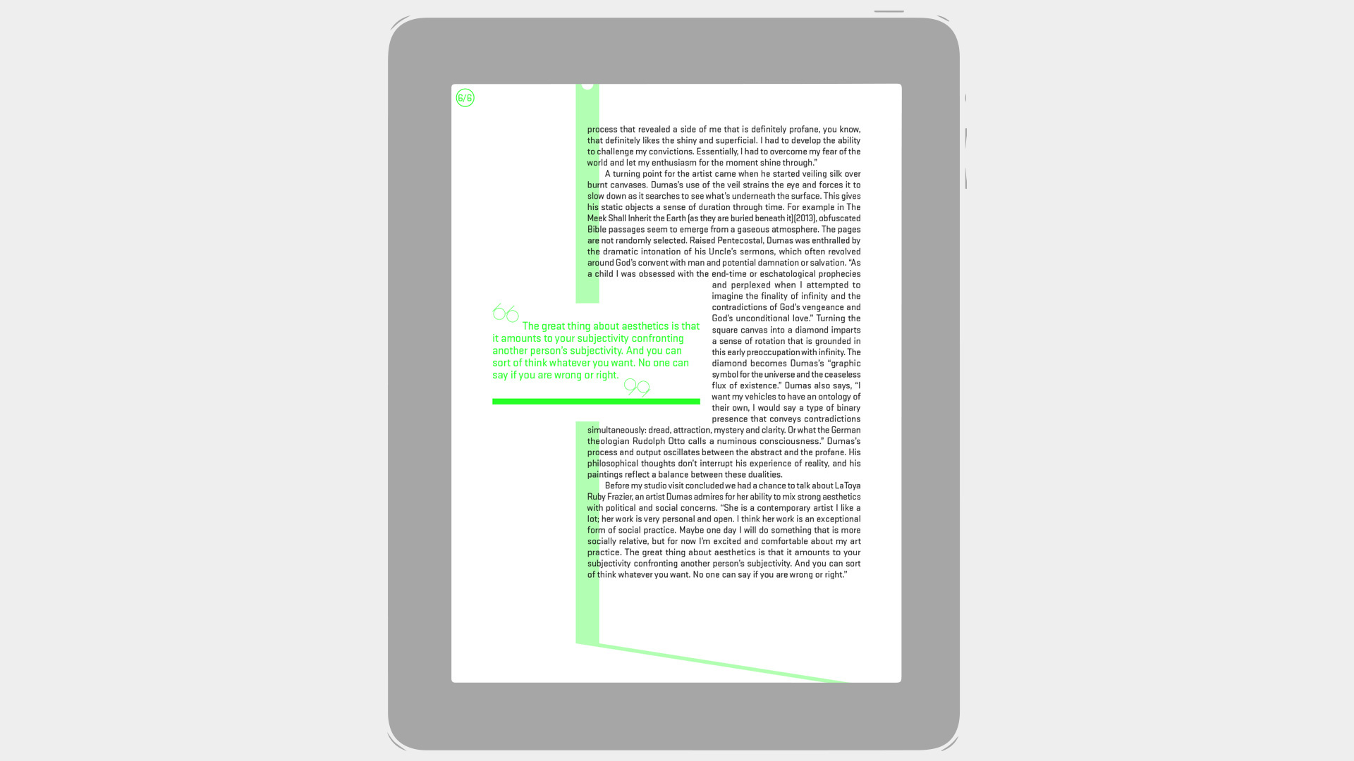
MAGAZINE TYPESETTING & LAYOUT
