HUTTON PHOTOGRAPHY — Commercial photography
Client: Ian Hutton Photography Year: 2011 Involvement: Designer
Branding for a photographer
As a newly started small photography business Ian Hutton Photography asked me to design the company's branding. Specialising in corporate and commercial photography, the targeted customer-base were in-house marketing and communication professionals as well as marketing and brand agencies. The branding needed to reflect Ian's down-to-earth and practical attitude. He wanted something minimalistic and modern without being too trendy.

Throughout the design process I used an iterative and participatory design process by involving Ian in the key decision points. For example when choosing font and colour, I showed him a small sample of fonts and colours that we then discussed and chose one of. This way, he was able to throughout the process guide the branding towards something he felt comfortable with. I find this continuos discussions with the client a valuable way to gain the necessary insights to reach a final design that meets the objectives and that the client is happy with.

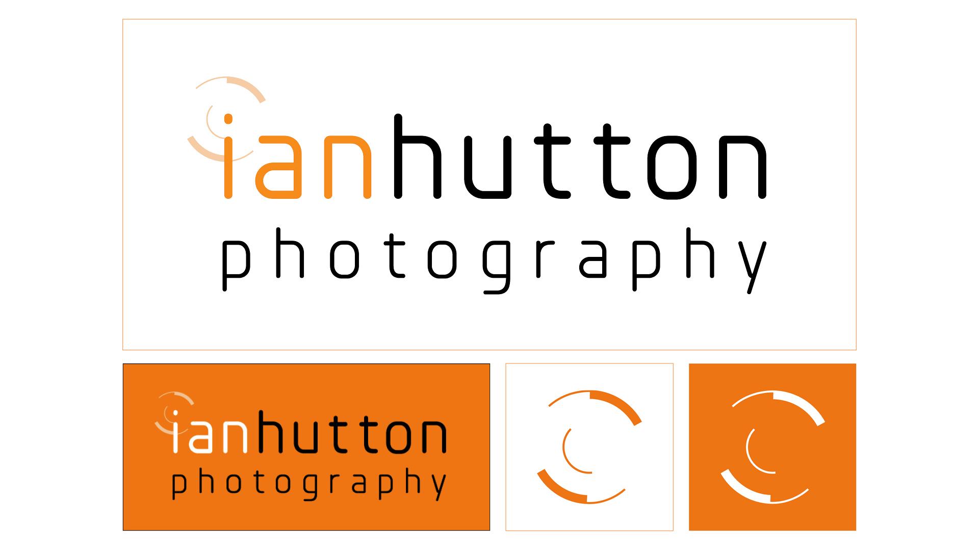
The Planer font was chosen for the logo as it is sophisticated and simple yet has a modern feel with a hint of fun and not overly serious. Using the all lower caps brings a certain playfulness that helps show the informality of Ian's approach as a photographer, which is reinforced by using the accent orange colour. Adding the illustration of a camera lens was my way of showing Ian's key skills: seeing and his ability to capture that.


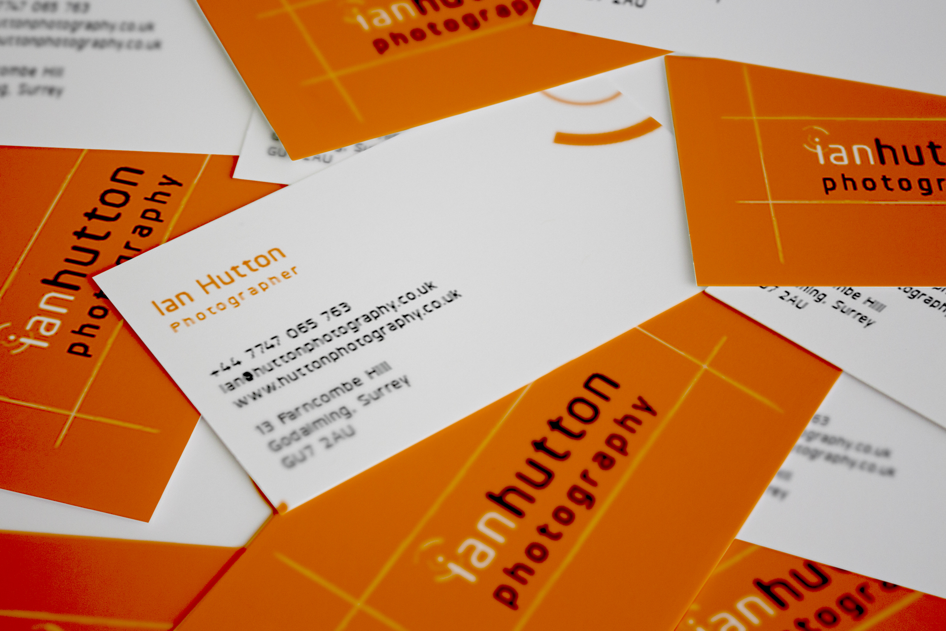
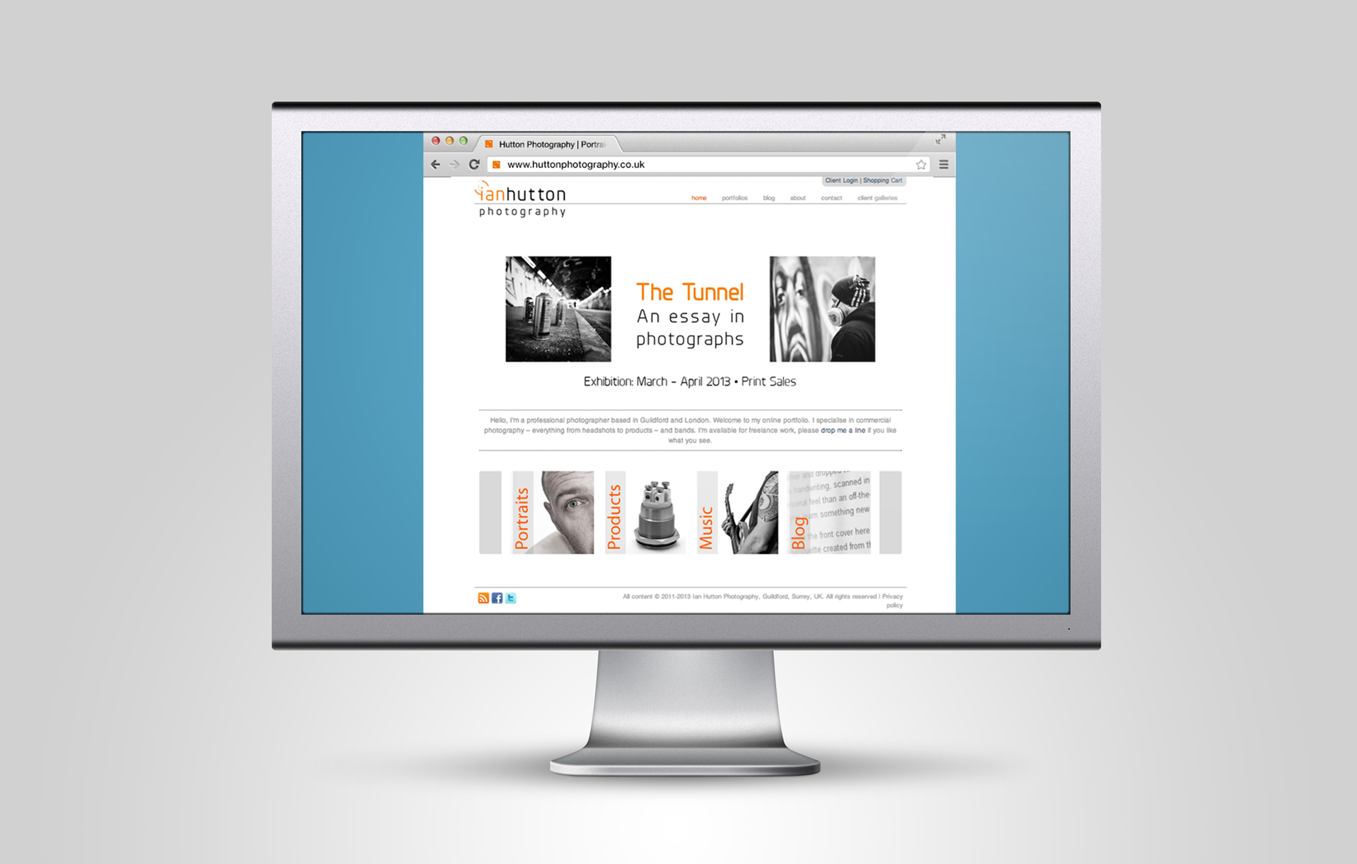
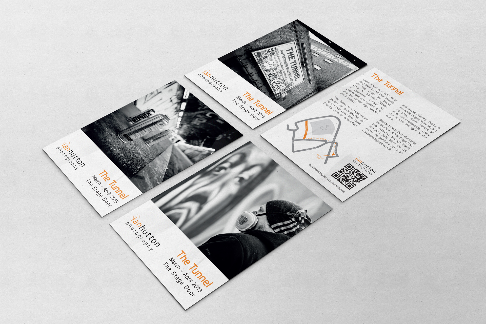
Final deliverables consisted of logo variants for print and web use, brand colour palette, typography, badges for social media use, business cards, promotional postcards for exhibition and website design.
